5 Ways to Use Notion Charts in your Real Estate Business
Subscribe to the All Systems. GO! Newsletter
This is one of their biggest launches in many many months.
Notion charts will unlock significant insights into your real estate business info and today I’m going to share 5 examples to get you started.
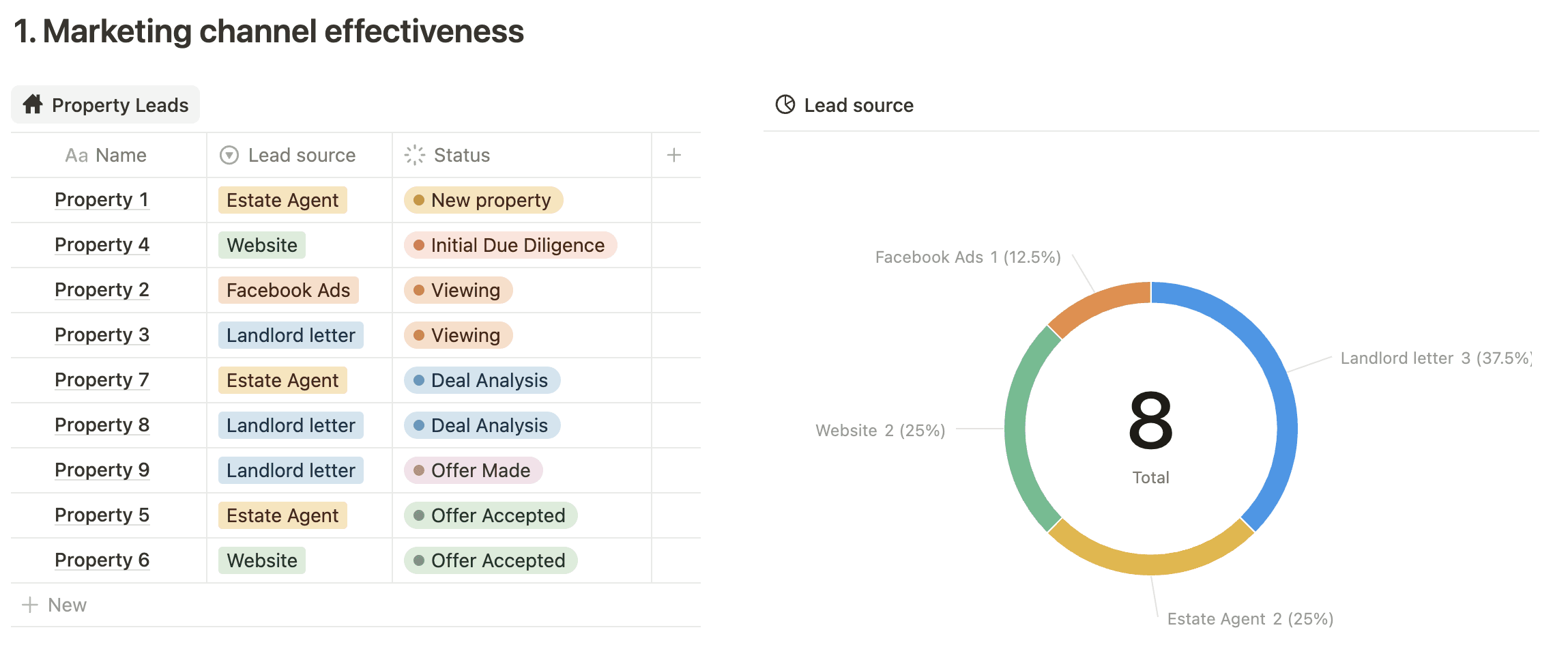
#1: Marketing channel effectiveness
Record where your property leads come from and use a Notion donut chart to visualise the breakdown per marketing channel.
Chart filters provide further ways to refine the information, such as only include property leads that are processing or leads sourced in the past 6 months.
Understanding what channel/s work best means you can focus more on what works in the future.
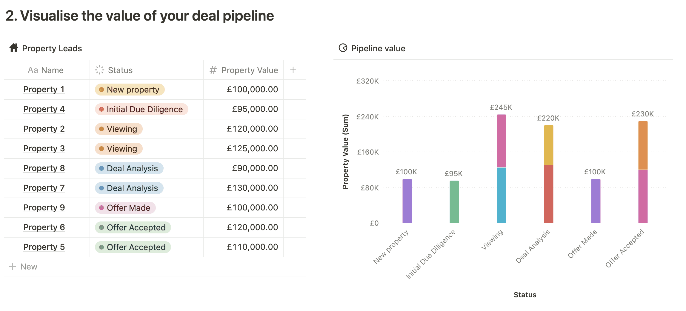
#2: Visualise pipeline value
Track the value of your property deal pipeline as they progress through the various stages.
This supports revenue forecasting, allocating people to the right tasks e.g. put more focus on moving higher value deals to the next stage, rather than getting distracted with ‘noisy’, less lucrative properties and also make improvements to the sales process.
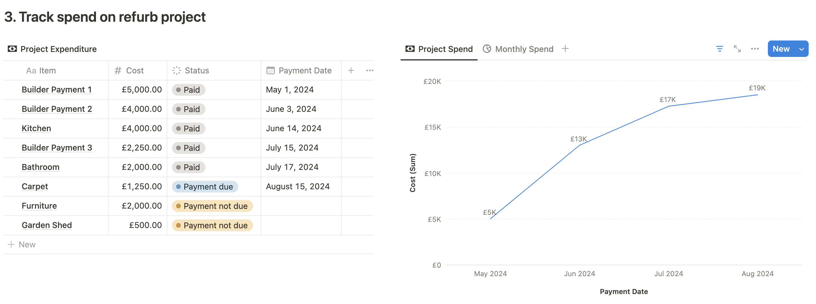
#3: Track refurb spend
Reduce the risk of running out of cash during a refurb by tracking the cumulative cash spend on a regular basis (weekly, monthly etc…)
Compare expected vs actual spend to spot problems ahead of time so you can take action early.
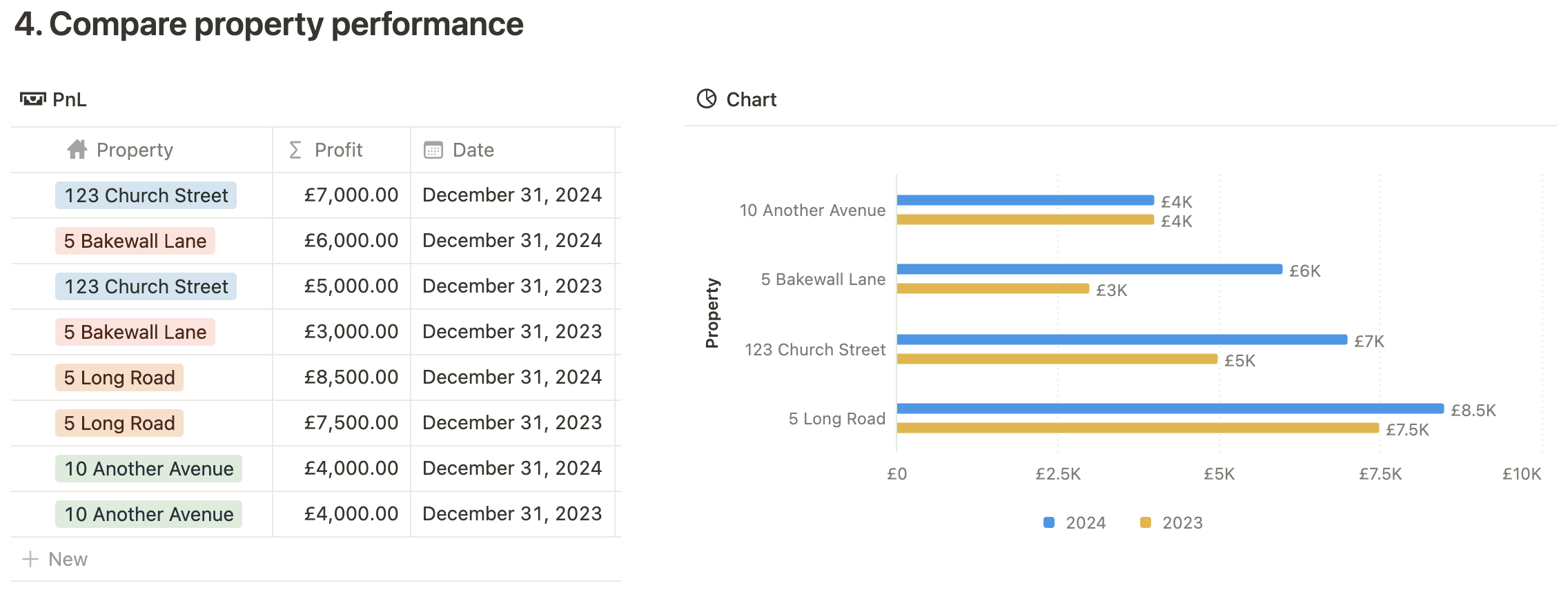
#4: Compare property performance
Keep an eye on your property portfolio’s performance by regularly reviewing income, expenditure, profit etc.
Plus compare properties to each other in one easy to view place.
Notion charts also support formulas so calculated figures like yields and ROI can be included.
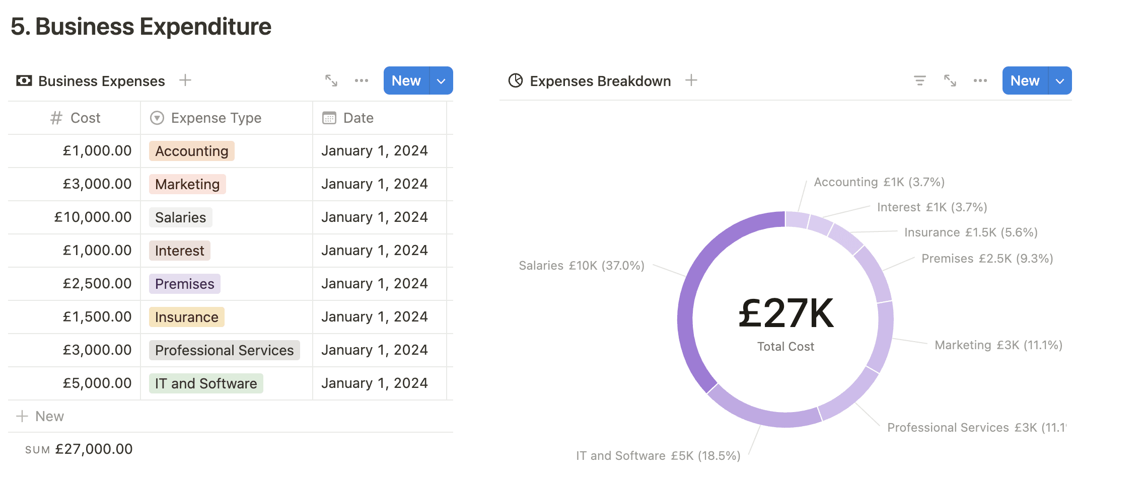
#5: Track business expenditure
The donut chart provides a clear breakdown of your business expenditure. Are any areas over spent and need to be reduced? Is the total too high and needs reigning in?
Use filters to focus on a particular time period or ignore particular costs like taxes.
Notion’s charts have only just been released and they still have a few limitations, including:
- unable to display multiple data sources on one chart
- no click through to the raw data
- no scatter charts
However, they're working on improvements over the coming months, so who knows what’ll be next ;-).
Join the All Systems. GO! newsletter for more Notion information every week…
Sign up to the 'All Systems. GO!' newsletter
The ONLY newsletter that delivers practical guidance to help you systemise your Real Estate investment business, directly to your inbox
Info
Contact Me: hello@andygaught.com


© Andy Gaught - The NOTION Real Estate Guy 2024. All Rights Reserved.
This website & Andy Gaught is not affiliated with Notion.